CSS Grid vs Flexbox: when to use each one
Grid is two-dimensional, Flexbox is one-dimensional. The right choice depends on what the layout is trying to do — not personal preference.
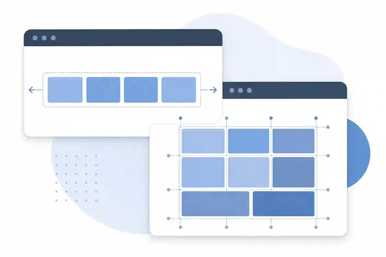
Every project starts the same way: someone uses Flexbox for everything. It works fine — until that layout with a fixed sidebar, header, and main content that needs to stretch to full height shows up. Then it turns into a series of flex-wrap, align-self, and min-height hacks nobody can maintain. The question that should have been asked earlier: is this layout a line or a grid?
That answer is the dividing line between Flexbox and CSS Grid.
The rule that explains everything: 1D vs 2D
Flexbox is a one-dimensional layout model — you distribute items in one direction: row or column. Grid is two-dimensional — you position items in rows and columns at the same time.
This distinction isn't spec marketing. It determines what each one can do naturally, without hacks.
With Flexbox, when you set flex-direction: row, items align in a single row. You control spacing, alignment, and wrapping — but each row is independent of the others. Flexbox has no way to make an item in one row "know" the width of items in the row below.
With Grid, you define tracks (columns and rows) and items snap into that grid. A cell in row 2 aligns perfectly with the cell in row 1 because they share the same column.
/* Flexbox: items in a row, no cross-row column control */
.nav {
  display: flex;
  gap: 16px;
  align-items: center;
}

/* Grid: layout with defined columns and rows */
.page-layout {
  display: grid;
  grid-template-columns: 240px 1fr;
  grid-template-rows: 64px 1fr auto;
  min-height: 100vh;
}
When to use Flexbox
Flexbox shines in components where the flow is linear and content determines the space.
Good use cases:
- Navigation bar with logo and links
- Button with icon + text side by side
- Tag / chip lists
- Card with stacked content
- Centering an element in a container (the classic
justify-content: center; align-items: center) - Distributing space between items with
justify-content: space-between
/* center vertically and horizontally — 3 lines */
.card-center {
  display: flex;
  justify-content: center;
  align-items: center;
}

/* button with icon */
.btn {
  display: flex;
  align-items: center;
  gap: 8px;
}

/* header with logo and nav at opposite ends */
.header {
  display: flex;
  justify-content: space-between;
  align-items: center;
  padding: 0 24px;
}
The signal that Flexbox is the right choice: you're thinking in one direction (either horizontal or vertical), and items can have different sizes without issue.
The signal that you're forcing it: you need items in different rows to align with each other. That's Grid's job.
When to use CSS Grid
Grid is for layouts where multiple items need to align on two axes — where the grid matters, not just the flow.
Good use cases:
- Page layout (header, sidebar, main, footer)
- Card grid with uniform height per row
- Image gallery
- Dashboard with widgets in fixed positions
- Forms with labels and inputs aligned in columns
/* classic application layout */
.app {
  display: grid;
  grid-template-areas:
    "header header"
    "sidebar main"
    "footer footer";
  grid-template-columns: 240px 1fr;
  grid-template-rows: 64px 1fr 48px;
  min-height: 100vh;
}

.header  { grid-area: header; }
.sidebar { grid-area: sidebar; }
.main    { grid-area: main; }
.footer  { grid-area: footer; }
/* responsive card grid without a single media query */
.card-grid {
  display: grid;
  grid-template-columns: repeat(auto-fill, minmax(280px, 1fr));
  gap: 24px;
}
The second example is one of the most practical tricks in modern CSS: auto-fill + minmax creates a responsive grid that adds columns as space becomes available — without a single @media query.
Combining both — the real-world approach
The most common pattern in production isn't choosing one or the other. It's using Grid for macro structure and Flexbox for internal components.
A complete app layout example:
/* Grid defines the overall page structure */
.app {
  display: grid;
  grid-template-columns: 240px 1fr;
  grid-template-rows: 64px 1fr;
  height: 100vh;
}

/* Flexbox organizes items inside the header */
.app-header {
  grid-column: 1 / -1;
  display: flex;
  align-items: center;
  justify-content: space-between;
  padding: 0 24px;
}

/* Flexbox inside the card too */
.card {
  display: flex;
  flex-direction: column;
  gap: 12px;
  padding: 16px;
}

.card-footer {
  display: flex;
  justify-content: space-between;
  align-items: center;
  margin-top: auto; /* pushes to bottom of card */
}
Grid doesn't know (or need to know) how items inside the header are organized. Flexbox doesn't know (or need to know) that the header spans grid-column: 1 / -1. Each tool does what it does best.
Why not just use Grid for everything?
The opposite temptation exists too — once you learn Grid, using it for everything. The problem is Grid is more verbose for simple linear flows. Centering a button with an icon using Grid:
.btn {
  display: grid;
  grid-template-columns: auto 1fr;
  align-items: center;
  gap: 8px;
}
Versus Flexbox:
.btn {
  display: flex;
  align-items: center;
  gap: 8px;
}
Both work, but Grid here is noise. The intent is less clear — you're creating a two-column grid when you just wanted to align two items in a row. Code that announces its intention is easier to maintain.
Grid also has less intuitive behavior with dynamic content in some cases — especially when the number of items varies and you want each item to take the space it needs, not a grid cell. Flexbox with flex-wrap is more natural for those cases.
Browser support: no concerns in 2026
Grid and Flexbox have over 97% support in all modern browsers. If the project doesn't need to support IE11 (officially dead since 2022), you can use any CSS Grid Level 2 feature — including subgrid, which landed in Chrome 117 and solved nested grid alignment.
subgrid is what you use when you have a grid container and want child items to participate in the parent's tracks, rather than creating their own grid:
.card-grid {
  display: grid;
  grid-template-columns: repeat(3, 1fr);
  grid-template-rows: auto;
}

.card {
  display: grid;
  grid-row: span 3;
  grid-template-rows: subgrid; /* children use parent tracks */
}
This ensures the title, image, and footer of every card line up on the same horizontal row, even with different content sizes — no JavaScript, no fixed height.
If you're building more elaborate grids and want to visualize the output in real time — CSS and Tailwind simultaneously — I use the CSS Grid Generator to prototype before coding. Especially useful for testing grid-template-areas naming before committing to the final structure.
The post on semantic HTML covers the header, main, aside, and footer elements — the ones you typically map to Grid areas. Both posts are worth reading together: semantics defines the meaning, Grid defines the positioning.
Frequently asked questions
Can I use Flexbox and Grid on the same element?
Not directly — display: flex and display: grid are mutually exclusive on the same element. But an element can be a Grid child and a Flexbox parent at the same time. That's exactly the combination pattern described above: Grid on the outer container, Flexbox on the inner components.
Does CSS Grid replace Flexbox?
No. They solve different problems. Grid is better for page layout and two-dimensional alignment. Flexbox is better for linear component flow. In practice, you'll use both — and the more you use each, the more obvious it becomes which one is the right tool for each situation.
Why isn't my Grid aligning items the way I expect?
The most common cause is not defining tracks explicitly. When you use display: grid without grid-template-columns, the browser creates an implicit single-column grid. Define columns with grid-template-columns and, if needed, rows with grid-template-rows. The other common cause is forgetting that gap doesn't affect outer margins — it only adds space between cells.
When to use auto-fill vs auto-fit?
auto-fill creates empty columns if space is available. auto-fit expands existing columns to fill the space. The difference is visible when you have few items: with auto-fill, empty cells take up space; with auto-fit, existing items grow to fill the row. For card grids where you want items to grow and fill the line, auto-fit is usually the right choice.
The choice is about intent, not preference
Flexbox and Grid aren't rivals — they're tools with different scopes. The question is never "which is better," it's "what is this layout trying to do?"
If the answer is "distribute items in one direction, with spacing and alignment" — Flexbox. If the answer is "position elements in a grid with row and column control" — Grid. If the answer is "structure the entire page" — probably Grid for the macro level and Flexbox for the components.
The confusion happens when you use Flexbox to do Grid's job — stacking flex-wrap and percentage width hacks where grid-template-columns would be three words. Recognizing the pattern before you start coding saves time and saves the developer who'll maintain it later.
- 01 UTF-8 and encoding problems: why accents break and how to fix them What UTF-8 is, code points, mojibake, and why accented text turns to garbage — the mechanism explained end to end.
- 02 MIT, Apache, and GPL Licenses: Practical Differences for Developers MIT, Apache 2.0, and GPL are not the same thing. Understand permissive vs copyleft, patent protection, and compatibility before shipping code to production.